SCRIPTOR
"Time does not efface what noble men leave behind, and their
prowess shines forth even when they are dead"
(Euripedes 480 - 406 BC)
I am feeling a little overwhelmed and more than a little nervous trying to follow in, both literally and metaphorically speaking, the footsteps of my predecessor. If I can do half as well, I shall indeed be satisfied.
Throughout the years that Chronos (Peter Hansell) has been reporting in our Journal, many changes have occurred. Repeated references have been made to "what hasn't changed"; or rather "what happened then, applies now."
It is with this in mind that my eyes were drawn to the paper by William J. Stenstrom and Roosevelt Brown, "When exhibiting, there's more to the print than the print" JBPA 46, pps 9-12 5 figs. 1978.
As professional exhibitors become more and more cognizant with their art, many superb photographs and illustrations fall short of excellence because of the way they are mounted for viewing. Stenstrom et. al. give basic but essential advice on how technically well-executed prints will look their best. The paper also covers the exhibit environment (professional exhibit coordinators - take note!) Fortunately, nowadays, solid movable stands are almost always used, both space saving, easily assembled and dismantled.
Two other papers published by Jirat-Wasiutynski T. in JAMM Vol 7. pps 51-53, a paper conservator of some note, on "Mounting boards and adhesives for photographic prints and works of art on paper" and in JAMM Vol 7 pps 138-143 "Paper permanence and durability." As so much time and effort goes into making and exhibiting top quality photographs, why not make sure they will endure? Stenstrom's and Wasiutynski's papers should be read conjointly.
Finally in this issue of JBPA, the first part of a mammoth paper on copyright by Marybeth Peters. If you have the fortitude to wade through the technicalities - is very well worth reading if only to compare with the copyright laws of this new century.
Scriptor.
With the passing of Peter Hansell, Ron Irvine picks up
the pen to continue "25 Years ago in the Journal of Biological
Photography" and writes under the pseudonym SCRIPTOR. Ron is a
long-time member of BCA and IMI, is a Registered Biological Photographer,
Fellow of the BCA and an Honorary Fellow of IMI.
ronirv@kos.net
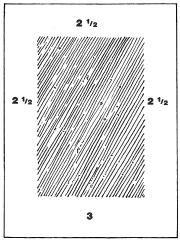
Figure 1. As a general rule, the dimensions of the borders of a mat should not be less than 2.5 inches on the top and sides and 3 inches on the bottom.
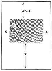
Figure 2. A horizontal print will appear aesthetically pleasing in a vertical mat providing the side margins are equal and the top margin slightly less than the bottom margin.
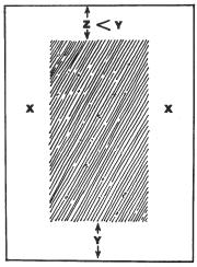
Figure 3. To have the bottom margin larger than the other margins, it may be necessary for the top margin to be smaller than the sides.
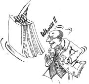
Figure 4. Free-hanging photographs are often difficult to view because of the undulating motion created by activity within the exhibit area.
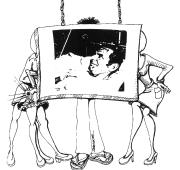
Figure 5. Disturbing background activity frequently distracts from the
photograph if it's free hanging.