Tim Phelps, M.S., FAMI
Pen and ink is a very versatile medium for use in publication. With patience and practice, a variety of textures can be successfully created providing medical and scientific illustrations with realism, that facilitate teaching and learning. Following your personal voice and developing confidence will lead to highly successful outcomes.
Inherent in its simplicity, pen and ink can exhibit a startling graphic presentation. Being created in a medium of no more than ink and an instrument used to apply it, rich tones and textures can be achieved. The delicacy to this art is akin to one's own handwriting — decorative, descriptive, and very personal. In its purest form, drawing in ink is a natural expression of the artist within. The medium also has a quality of finality. When ink is put to paper, it is there literally in black and white. Its finality is also expressed in its crisp and bold statement; any hesitation in the mind or hand will surely show itself as a lack of confidence in drawing. The medium can test your will, but is quite satisfying once you harness it. Pen and ink is primitive, demanding, delightful, and vital. I hope it brings as much joy to you as it does to me.
A variety of possible line treatments abound. Any number of marks or strokes used singly or in combination will allow you to effectively and expressively illustrate a variety of textures such as bone, muscle, hair, and fur, feathers, and tree bark in scientific illustration and medical illustration (Figure 1). Given your imagination and inherent drawing skills, keen observation and practice will yield spectacular, professional and personal results.
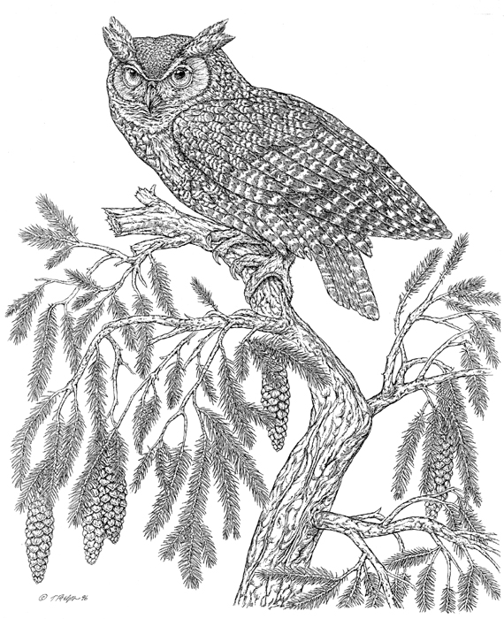
Figure 1. Curved strokes describe bark texture and suggest an organic quality and keep the artwork from looking too stiff and mechanical. An abbreviated short line style captures the mottled pattern of the Great Horned Owl's soft wing feathers. Artist's collection, limited edition print, 1996.
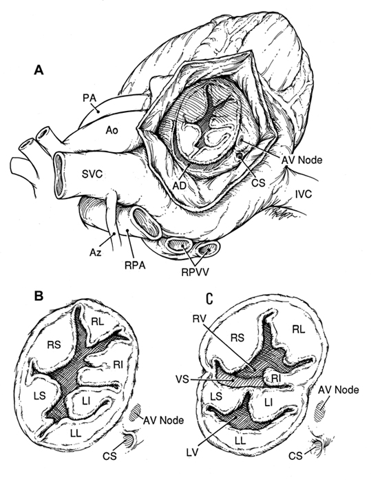
Figure 2. Rapid lines and strokes can be produced quickly and easily
with disposable pens. Native Anatomy of Atrioventricular Canal, Critical
heart Disease in Infants and Children, Nichols et al, Mosby, 1995, and
second edition in press 2004.
My pen work displays rendering in the areas of information, with an emphasis on outlines and a combination of refined realistic and casual strokes. Stipple and squiggles are freely intermingled as I strive for freedom of style and stroke. The importance of finding and developing your own style must be stressed. In the beginning, it is advisable to view as many artists and their unique approaches as possible to find those that are suited to your present abilities and future desires. In time you will develop a palette of pen strokes from which to choose, keeping some styles as your own, casting off a few while developing others. Your proficiency will improve as you gain confidence. It will necessitate experimenting with a variety of pen nibs, points, and paper surfaces to discover which are best suited to you.
Flexible pen nibs come in a variety of sizes and shapes. Each has a “stiffness” that dictates how hard you must press to release the ink from its “quills” The more flexible the nib, the more dexterity you must develop to control the line quality for detailed illustrations. The Gillott #290 and # 291 are two fine pen nibs with flexible quills. A stiffer multipurpose nib is the Gillott #659. The Hunt #104 is even more rigid, requires more pressure, and is suited for stiffer drawing styles. For the most expressive drawings, a flexible nib or a sable brush will probably be the most satisfying approach for displaying spontaneity to the finished art. Technical and disposable pens create lines of a single width allowing for minimal line thickness, but they eliminate the need for constant dipping into bottles of ink. The Pigma Micron disposable pen with its slightly rubbery tip has been my recent choice. Some line variation is possible, and expressive and rapid lines and strokes can be produced quickly and with ease. I have used this pen in the creation of hundreds of illustrations for books and journal publications over the past seven years (Figure 2).
Selection of the appropriate inking instrument will be dependent upon the surface you choose to use; a variety of boards and surfaces are available for pen and ink drawing. Scratchboard is the preferred surface for achieving the richest lines and broadest tonal range; it gives artists the ability to scratch back to white with knives and tools in the drawing's darkest areas. Flexible pen nibs work best on this surface. Scratchboard can, however, be time-intensive in board preparation, final sketch preparation and transfer. Should you choose this approach, Essdee brand is an excellent board choice.
Strathmore Bristol is another fine surface with its paper tooth for all pens and nibs but does not allow for scratching back into the black areas for full tonal range like scratchboard. And, like scratchboard, it may require a transfer drawing or working on top of a light box. Various drafting films and vellums will accept nibs, pens, and brushes, but the ink may spread or bleed slightly depending on the tooth or surface texture. Some films will have a longer ink drying time. Because of their translucency, film and vellum can be placed directly over your initial sketch, retaining the spontaneity of your sketch. Inking on film or vellum also eliminates the need for a light box or manual transfer. A minimal amount of scratch back or line scoring can be achieved, however, with film or vellum. Each of the above surfaces will add to the development of your personal style, and so decisions regarding pens and surfaces rests squarely on your shoulders, and at your fingertips. It is important to experiment with a variety of nibs and pens on a variety of surfaces to see which papers and pen marks are best suited to you and your personality.
Figure 3. Rendering takes shape with the use of a variety of line weights
and strokes, with continual observation of the predetermined focal point.
Salamander Dissection, Amphibian Medicine and Captive Husbandry, Wright
and Whitaker, Krieger, 2001
Important Considerations
Salamander Dissection (Figure 3) provides a template for the discussion to follow.
- In preparation for the final illustration a series of guidelines should
be added to your sketch to provide a basis for line direction in the
final ink rendering. This sketch becomes a roadmap for all line work
to follow.
- The initial sketch prepared for inking also should include a range
of light and dark accent areas with midtones in between. The ink lines
you will create are by now loosely based on a gray scale you have formulated
either directly on your sketch or indirectly in your mind. This would
include assigning certain tonal values to specific tissues as needed.
It can also include making adjustments to tonal areas to further direct
the viewer's eyes by broadening tones in the focal area and lessening
tones in areas out of focus or in the periphery.
- The focal area should always carry the greatest amount of rendering
with the broadest range of tone along with distinct, descriptive detail.
To draw the viewer in for didactic instruction, render with broad tones
in the center of the drawing and allow the peripheral areas to fall
away to lighter shades of gray.
- Begin with outlines in the focal area and then trail the lines to
the periphery. The lines are accented in weight with the intent to draw
the viewer in. Midtone areas are lightly established with thin and carefully
placed lines and then tapered out. The power of an effective pen and
ink illustration lies in not only what is put in, but also often what
is left out.
- Rendering takes shape with the use of a variety of line weights and
strokes, with continual observation of the predetermined focal point.
Always keep the focal point in mind with the intent of displaying the
broadest range of value and detail. Both highlights and shadows will
be their strongest here. Broken junction lines and lost edge lines will
display aerial or atmospheric perspective.
- Move out into the periphery of the illustration with the question
of line weight strength — should more or less rendering be added?
If there are areas which need to be lessened, they can be erased entirely,
shaved down, or scratched through with an X-acto blade. Lines also can
trail off with short lines or dots.
- Areas in the main portion of the illustration may call for further emphasis. Cross-hatching will further strengthen or broaden tones. Accents of black in recesses and shadows will impart sparkle and focus.
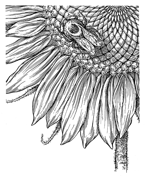
Figure 4. Use of varied line weights and cross-hatching achieves a
very effective and informative use of line as tone. Detail of Sunflower
Visitors, Artist's collection, limited edition print, 1995.

Figure 5. Plausible presentation of tone and texture are hallmarks of effective pen and ink illustration seen in an illustration of a hair follicle. From Johns Hopkins Family Health Book, Harpers Resource, 1999.
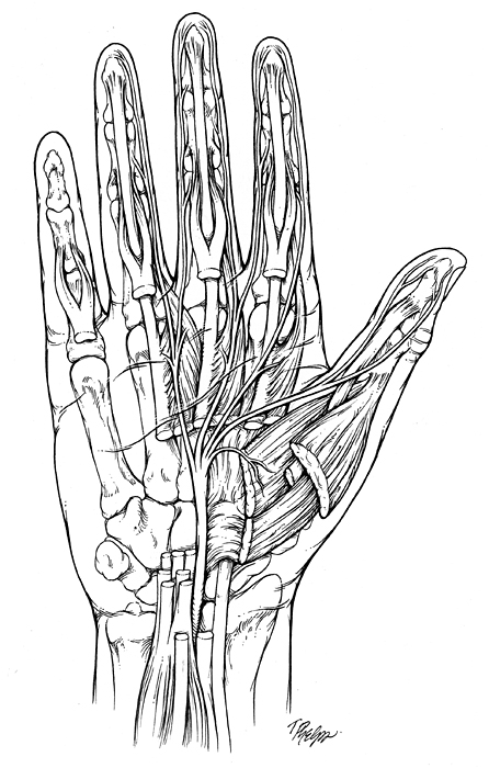
Figure 6. Effective use of the pen line and stroke and a variety of
pen marks depict bone, muscle, fascia, and skin in this illustration of
The Course of the Median Nerve in the Palm, proposed artwork for T. Brushart,
M.D., orthopedic text, 2004.
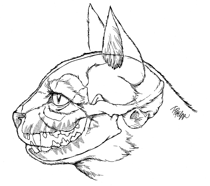
Figure 7. Only plastic accented lines and limited use of stipple are used to communicate the educational intent of this illustration of Feline Dentition, Catnip Newsletter, Tufts School of Veterinary Medicine, 1996.
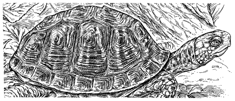
Figure 8. Both local color and texture are described in the shell detail by a variety of line treatments. From an illustration of an Eastern Box Turtle. Artist's collection, limited edition print, 1991.
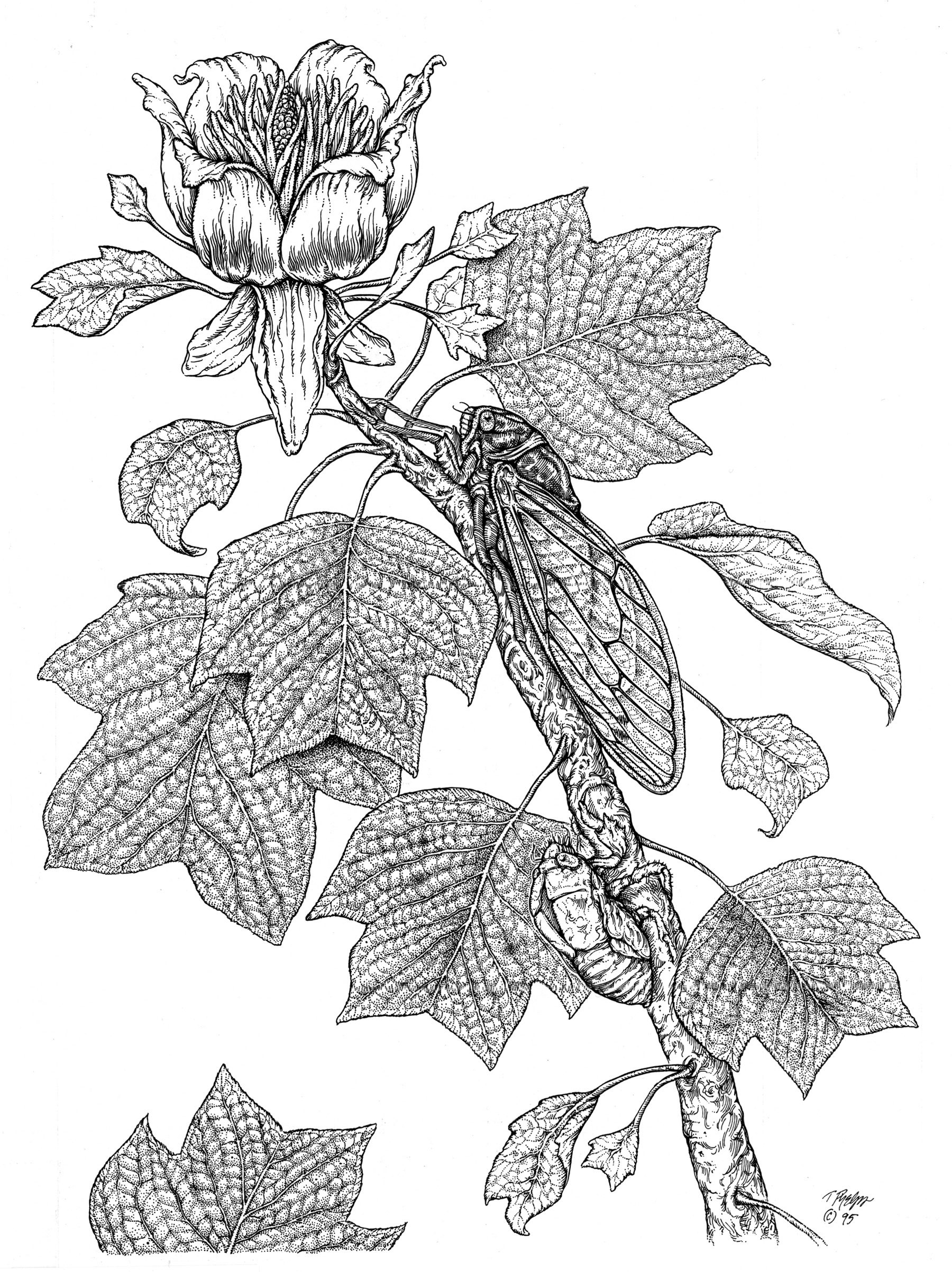
Figure 9A. Subtle lobulation is achieved with careful and deliberate stipple. Decorative dots in an orderly fashion provide an organic and natural texture. Dog Day Cicada, Artist's collection, limited edition print, 1991.
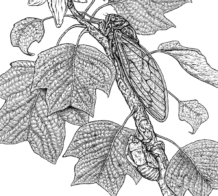
Figure 9B. Close-up image of "Dog Day Cicada on Tulip Poplar"

Figure 10. Vigorous, and frenetic lines mimic the energy of jazz musicians and their music; the liveliness of line speaks to the nature of jazz and the confidence of the artist. These Guys Wail, Artist's collection, limited edition print, 1989.
More Examples
In this close-up of the sunflower (Figure 4), the use of varied line weights and cross-hatching achieves a very effective and informative use of line as tone. By placing long streaking lines side by side with variations in thickness, the surface texture of the sunflower petal comes alive. Thin lines placed closely together yields a gray tone, further capturing the look of the undulating surface of the flower's fragile petals. Accented outlines of varying thicknesses complete petal edges. Short lines and cross-hatching are used in shadow areas providing subtle and delicate tone; they also provide a realistic look to the fine fur of the bumblebee.
Plausible presentation of tone and texture are hallmarks of effective pen and ink illustration seen in the illustration of a hair follicle (Figure 5). Each quality is determined by the thickness of line weights, the space between them, the amount of black used for accents, and the size and amount of highlights. Other factors include the application of secondary lines with cross-hatching and the amount of white of the paper remaining, anchoring the illustration. Each tissue type important to the instructional content is shown effectively with values assigned to delineate not only tissue-specific tone and texture, but also depth, light, and shadow.
The Course of the Median Nerve in the Palm (Figure 6) displays an effective use of the pen line and stroke to depict bone, muscle, fascia, and skin. Long parallel lines with varied thicknesses depict the texture of muscle; thicker lines combined with thinner ones, along with the selective absence of line, display not only individual fiber bundles but also light and tone. Shorter lines, along with dots and dashes, define fibrous sheaths. Squiggles, stipple, and irregular marks describe protuberances, muscle attachments, and pitting of bone. Black triangular accents at the intersection of crossing lines portray shadow recesses and give sparkle to the overall drawing. Accented outlines with sketchy marks in the hand hold the contents of the anatomy in place, framing the drawing and its educational content. The illusion of transparency is displayed from scored white lines around the black lines of palmar creases — dropping structures below the surface. This illustration is presented without labels for clarity of artistic instruction.
Only plastic accented lines and limited use of stipple are used to communicate the educational intent of this illustration of feline dentition (Figure 7). Outline is never one single stroke or thickness; plasticity is implied with repeated thick and thin line stroking and overlapping secondary lines and marks characteristic of fur. Carefully spaced stipples define the roots of the teeth, providing a gray tone. Deep outlines are cut through and dashed to imply transparency to bone beneath the surface of skin or fur.
Both local color and texture are described by a variety of line treatments in the shell detail from the illustration of a box turtle (Figure 8). Accented lines illustrate the growth lines and surface texture of the shell. Evenly spaced lines placed diagonally describe coloration and tone on each shell segment. Highlights are scratched away along the ridges of the growth lines, further enhancing the shell's believable topography. Further scoring of lines softens the tone and detail in the highlighted areas.
Subtle lobulation in the tulip poplar's leaves was achieved with careful stipple in this detail from Dog Day Cicada on Tulip Poplar (Figures 9A and 9B). Decorative dots in an orderly fashion, were situated in patterns throughout each leaf; larger dots and clusters of smaller ones provide an organic and natural texture. The flat arrangement of the leaves was purposeful, providing an interplay of positive and negative spaces, that contribute to overall design. Curved parallel lines in the bark define form and texture; craggy lines characterize the texture of the cast-off carapace of the emergent annual cicada.
Curved strokes help describe the bark texture as well as its direction of growth and volume in Loose in the Spruce (Figure 1). Curved ink lines suggest an organic quality and keep the artwork from looking too stiff and mechanical. An abbreviated short line style captures the mottled pattern of the Great Horned Owl's soft wing feathers. Repeated patterns on each feather describe the owl's overall distinct camouflage marking. Changing line direction and cross-hatching in patches adds visual interest to the drawing. By using an X-acto knife, pen lines can be scored and broken to further soften the look.
As you become more comfortable with the medium, you will loosen up with “casual” or more spontaneous strokes and marks. The casual approach is successful when it provides definition to the intended subject's meaning — conveying the look of muscle, fat, or bone and still expressing aesthetically the illustrator's abilities as an artist and educator. If enough information is given and implied, then the drawing will be successful. As you become more comfortable with pen and ink, this looseness will emerge. Your visual vocabulary will broaden as well, as you depict a structure and its meaning in a limited number of strokes. Some of us are natural renderers, while others of us say the most with the least. Pen and ink can be both frustrating and rewarding at the same time, but it is well worth the effort.
The best examples of pen and ink display the artist's touch — a sense of the artist's hand and personality — a vigor, vitality and confidence with the medium. Undaunted and unafraid to express through the stroke of the pen the intensity of black and white, pen and ink demands that you express yourself freely and develop your own voice and become comfortable with it. Don't be afraid; savor the opportunity to venture into a new medium. Enjoy these moments of chaos tempered with creativity (Figure 10).
Tim Phelps (thphelps@medart.jhu.edu),
Associate Professor, has been teaching and illustrating for 18 years in
the graduate program of Art as Applied to Medicine, Johns Hopkins, Baltimore,
Maryland. He has received numerous regional and national awards for his
work published in textbooks, magazines, and professional journals. His
artwork has been displayed in more than 40 group and solo exhibitions
created in a variety of media including pen and ink, colored pencil, watercolor,
and airbrush. Phelp's is a Past President and Past Chairman of the Board
for the Association of Medical Illustrators. He was the principle illustrator
for the Johns Hopkins Family Health Book published in 1999, a contributing
illustrator for the Smithsonian's Ocean Planet, a traveling exhibit, and
is a coauthor of Surgical Pathology Dissection: An Illustrated Guide,
now in its second edition. Most recently, he authored and illustrated
a book on the history of hot rod flame painting, recreating more than
300 diecast examples in small scale, in press, 2004.